Usage
The Usage page is the spend, activity, and value dashboard. It answers three questions at once: what did we use, what did it cost — and what was it worth. It’s the page you check first thing every morning to know whether anything blew up overnight.
There are two editions of the same dashboard:
- PebbleObserve → Usage (every user) — “See what you have used and what it cost.” Scoped to you, with a Capability Activity panel underneath.
- Admin → Organisation → PebbleObserve → Usage (org admins) — “See what your organisation is using and what it costs.” Scoped to everyone, with a Usage for switch (Everyone / Just me).
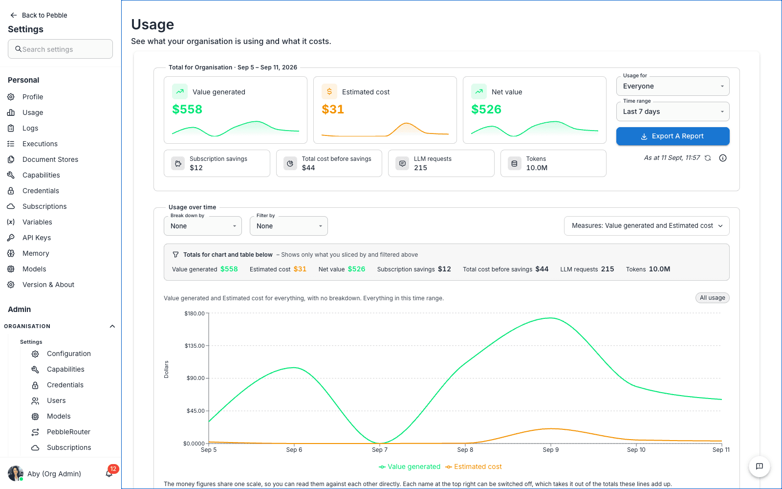
The summary card
The headline card totals the selected time range:
| Figure | What it means |
|---|---|
| Value generated | The estimated worth of the work Pebble did — effort saved, priced at your organisation’s labour rate (see Value) |
| Estimated cost | What the underlying model calls cost |
| Net value | Value generated minus cost — the number that justifies the platform |
| Subscription savings / Total cost before savings | What subscription-covered models saved you against list pricing |
| LLM requests / Tokens | Volume counters |
Every figure explains itself on hover. Controls beside the figures:
- Time range — Last hour, Last 3 hours, Last 24 hours, Last 7 days, Last 30 days, Last 90 days, or Custom range with From/To pickers
- Export a report — server-side exports: Daily activity, By model, By user (org view), By flow, By provider, By endpoint, By skill, By conversation, and more
- An “As at” stamp with a reload button
Figures come from Pebble’s own usage ledger — every model call recorded first-party, whether it went through PebbleRouter or direct to a provider, and attributed to the user, conversation, flow, skill and workspace that caused it.
The explorer — Usage over time
Below the summary, the Usage over time chart and its companion table (The numbers behind the chart) form a proper explorer:
- Break down by — slice the series by User, Tool, Flow, Flow run, Skill, Prompt, Assistant, LiveApp, Plugin, Integration, Conversation, Workspace, Project, Provider, Model, Routing, or Request format. Each option explains itself on hover — e.g. Flow run: “One execution of a flow. ‘Flow’ totals every run of it together.”
- A value picker appears beside the dimension when it’s filterable — pick exactly which flows, users, or runs you want, with search and select-all
- Filter by — stack additional filters; active ones render as removable chips with Clear all
- Measures — choose what the chart plots: Value generated, cost, Tokens, LLM requests, Times used
- A tinted Totals for chart and table below strip shows the totals for your current slice — only what you sliced by and filtered above
- The table offers Columns selection and Export this table
Common workflows
“Why did spend spike on Tuesday?” — Custom range around Tuesday → break down by Model to see which model drove it → switch to User or Conversation to see who and where → open the conversation.
“What does this flow cost per run?” — Break down by Flow run, pick the flow’s runs in the picker beside it. Older runs may show value with no cost beside it — cost attribution only exists from the point run attribution shipped; that’s missing data, not a free run.
“Is my routing actually saving money?” — Break down by Model and check the mix: heavy on your fast model, light on the expensive one. Inverted means routing needs tuning — see PebbleRouter.
“Which capabilities earn their keep?” — Break down by Skill, LiveApp, or Integration and compare value generated against cost.
Value — configuring what Pebble use is worth
Value is computed per use from two ingredients, both admin-configurable:
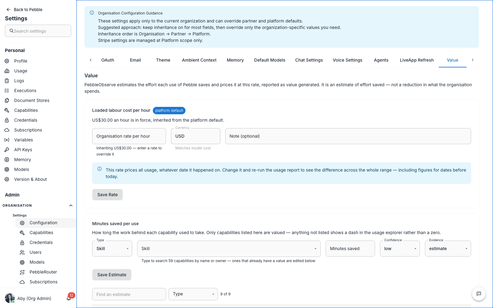
- A labour rate — the fully loaded cost per hour of the people whose effort Pebble saves.
- An effort model — either flat minutes saved per use for a capability, or percent of previous time taken per conversation: “Pebble work took 25% of the time it used to take”, with an idle-gap cap so a chat left open overnight doesn’t count as saved hours.
Where to set them:
- Org Admin → Settings → Value tab — the organisation’s Loaded labour cost per hour, per-capability Minutes saved per use estimates, and the Percent of previous time taken card with its Default for all conversations and per-capability overrides.
- Platform Admin → Settings → Usage tab — the platform-wide Default Labour Rate and Default Conversation Value panels that apply wherever an organisation hasn’t set its own. Sensible defaults are seeded out of the box, so value figures appear without any configuration; organisations override them in their own Value tab.
Every card shows where its current number comes from — an organisation override or the platform default — and keeps a history of previous values.
Capability Activity
On the personal PebbleObserve → Usage page, a Capability Activity panel lists your last 7 days of non-LLM activity — skills, LiveApp button runs, and connected-tool calls — with Time, Type, Capability, Source, Status and Duration columns and a Type filter.
Tips
- Make this a daily habit. Five seconds on the summary card catches most weirdness before it becomes a problem.
- Lead with net value, not cost. The value figures exist so the AI conversation isn’t only about spend — set a realistic labour rate and the dashboard makes the business case for you.
- Watch the model mix. Break down by Model monthly; a healthy mix is heavy on fast models.
- Export for finance. The report exports are server-side and complete — not a screenshot of the current page.
Related
- Logs — drill from a usage anomaly into individual requests
- Evaluations — measure quality, not just cost
- PebbleRouter — tune the routing that drives the model mix
- PebbleObserve (user-facing) — the deeper observability platform behind these dashboards