Shortcuts & the Prompt Library
Shortcuts are launch tiles that live in two trays attached to the PebbleChat message composer. One click runs a saved prompt — complete with its saved model, skills and integrations — opens a Flow or LiveApp, or jumps to an external link. The saved prompts behind them live in the Prompt Library, where they can be searched, run, shared with individuals, and published across your organisation.
The shortcut trays
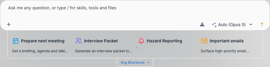
Two trays sit against the composer:
| Tray | Handle label | Where | Who fills it |
|---|---|---|---|
| Personal | My Shortcuts | Centred on the composer’s top edge | You |
| Organisation | Org Shortcuts | Centred on the composer’s bottom edge | Admins with pin permissions |
The trays keep out of the way until you want them:
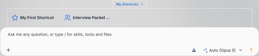
- Handles are hidden at rest. Hover the composer for about half a second and they fade and slide into view.
- Click a handle to open or close its tray — the chevron on the handle points in the direction it will move.
- Keep hovering the tray for a few seconds and the small add (+) and pin controls appear inside the handle.
- Pin a tray open with the pin control (tooltip Pin open). A pinned tray stays open, including after a page refresh. Unpin to restore auto-collapse.
- On a new chat the personal tray starts expanded and the organisation tray starts collapsed. Launching any shortcut collapses both trays so you can get on with the conversation.
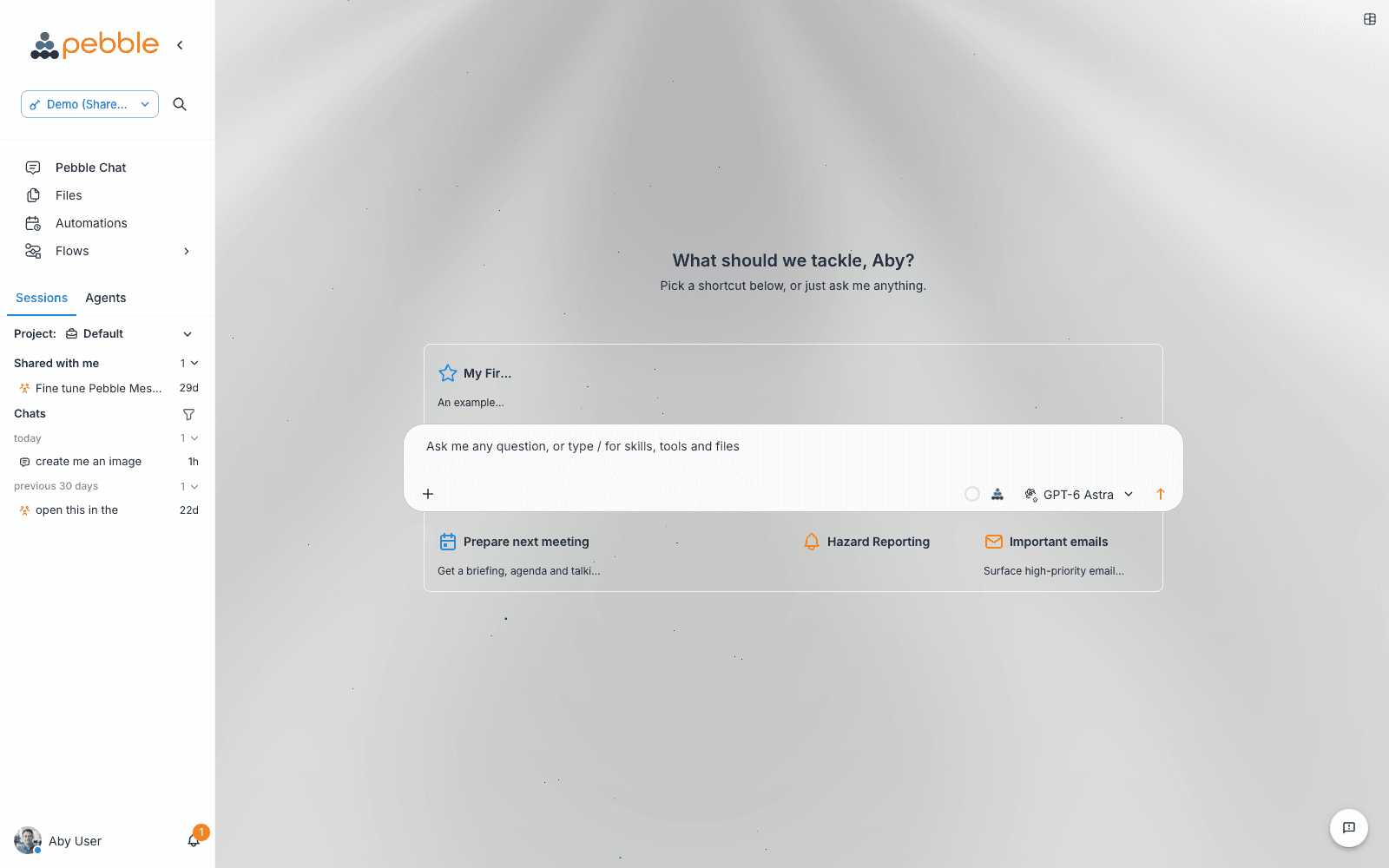
A tray only appears when it contains at least one shortcut. If you remove every personal shortcut, the My Shortcuts handle disappears entirely — save a prompt or add a shortcut to bring it back.
The organisation tray
The Org Shortcuts tray is curated by your admins. It merges organisation, workspace and project pins for your current context, de-duplicated with the most specific scope winning (project beats workspace, workspace beats organisation). You can launch any tile in it, but only users who hold the pin permission for a tile’s scope can move, edit or remove it — everyone else sees a read-only arrangement. If you try to drag a tile you can’t manage, PebbleChat tells you: “You don’t have permission to arrange this deck — your changes weren’t saved.”
What a shortcut can launch
| Target | What happens when you click the tile |
|---|---|
| Prompt | Runs the saved prompt immediately — from the new-chat landing it starts a fresh chat; mid-conversation it runs in the current one. The prompt’s saved model, auto-context setting, skills and integrations are all applied. |
| Flow | Opens the flow canvas for that Flow |
| LiveApp | Opens the LiveApp beside your conversation in the Canvas pane — no AI turn is used |
| Predefined shortcut | A ready-made item from the catalog, with its own name and icon |
| External link | Opens the URL in a new browser tab |
Prompt shortcuts run the prompt straight away — they don’t pre-fill the composer for editing. If you want to tweak a saved prompt before sending, open it in the Prompt Library and use Insert into composer instead.
Creating a shortcut
Hover an open tray until the + control appears in the handle and click it, or right-click any tile (or empty tray space) and choose Add. Either way you get the Add a Shortcut dialog.
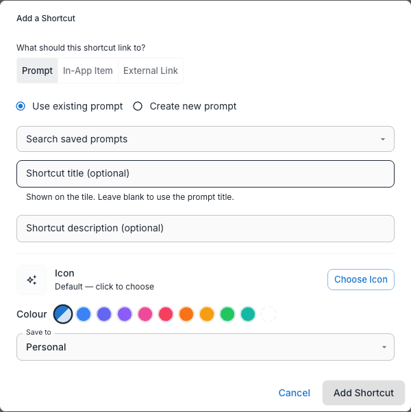
Under “What should this shortcut link to?” pick one of three targets:
- Prompt — choose Use existing prompt (with a “Search saved prompts” autocomplete) or Create new prompt, which shows the same inline form as the Save as Prompt dialog.
- In-app item — an Item type dropdown offers Flow, Predefined shortcut and LiveApp, each with its own picker and a Shortcut title field. The title is required for Flows and LiveApps; predefined shortcuts default to the catalog item’s own name and icon. (Predefined shortcuts are only offered when creating a shortcut, not when editing one.)
- External link — a required URL field plus a required Shortcut title.
The Save to dropdown decides which tray the shortcut lands in: Personal is always available, while Workspace, Project and Organization appear only if you hold the matching pin permission. Click Add Shortcut to finish (Save changes when editing).
Making tiles your own
Every shortcut — and every saved prompt — has appearance controls:
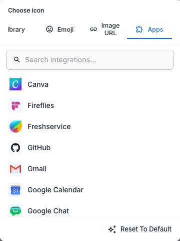
- Icon — click Choose icon (or Change) to open the icon chooser. It has four tabs: Library (a curated icon set with search and a recents row), Emoji (a curated grid, or paste any emoji), Image URL, and Apps — which appears when you have connected apps and lets you use a connected app’s logo (the HubSpot logo, say) as the tile icon.
- Colour — 10 preset swatches (Default, Blue, Indigo, Purple, Pink, Rose, Orange, Amber, Green, Teal) plus a custom colour picker.
- Description — an optional short line that larger tiles reveal below the title.
Arranging the tray
Tiles sit on a fine snap grid, and there’s no separate edit mode:
- A quick click launches the shortcut; dragging moves it (if you’re allowed to arrange that tile). A faint dotted lattice appears while you drag, and the layout saves automatically.
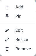
- Right-click a tile for the context menu: Add, Pin (or Unpin), then Edit, Resize and Remove. Right-clicking empty tray space shows the same menu with the tile actions disabled.
- Resize arms handles on that one tile — drag it out to the left, right, down or the bottom corners. Tile size controls how much it reveals: the smallest tile is a bare icon, a wider tile shows the title beside the icon, and a taller tile shows the description underneath. The icon itself never changes size.
- Remove shows a confirmation dialog (“Remove shortcut”) before unpinning the tile. Removing only unpins — the underlying saved prompt stays in the Prompt Library and can be pinned again later.
Prefer keyboard precision to dragging? Edit a prompt shortcut and open the Tile size & position accordion — numeric Width (cols), Height (rows), X (column), Y (row) and Page fields do the same job as the mouse.
Starter shortcuts
You’re never staring at an empty tray on day one. Every new user gets a personal My First Shortcut (star icon, indigo) that demonstrates how shortcuts work, and the organisation tray comes seeded with Prepare next meeting (calendar icon, blue) and Important emails (mail icon, amber).
Removing a seeded shortcut is permanent — it won’t be re-seeded, so delete the starters only once you’ve built shortcuts of your own.
The Prompt Library
Every prompt you save lands in the Prompt Library, whether or not you also pin it as a shortcut. The library is where prompts are found, run, forked, shared and published.
Saving a prompt from a conversation
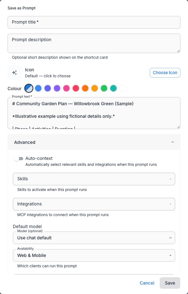
Every chat message’s action bar has a star button with the tooltip Save as prompt. It opens the Save as Prompt dialog:
| Field | Notes |
|---|---|
| Title | Required |
| Description | Optional — shown on the shortcut card |
| Icon and Colour | The same appearance controls as shortcut tiles |
| Prompt text | Required — prefilled from the message you starred |
| Advanced | An Auto-context switch, Skills and Integrations multi-selects, an optional Model picker (an empty selection reads “Use chat default”), and an Availability dropdown: Web & Mobile, Web only or Mobile only |
The Also add to my shortcuts checkbox is ticked by default. The prompt goes into the Prompt Library either way; ticking the box additionally pins a tile and reveals the Save to scope picker. For Personal scope there’s also a Show shortcut in dropdown — Always, Current Workspace only or Current Project only — controlling where the tile appears in your personal tray.
The dialog also shows a disabled System prompt field. Per-prompt system prompts are coming in a follow-up release — the field is visible but not yet applied when the prompt runs.
Finding prompts in the catalog
The Prompt Library is the Prompts tab of the Capabilities Catalog. Reach it from Settings → Capabilities in the sidebar (see Personal Capabilities), or from the composer’s Capabilities & Context menu via the gear icon (“Open capabilities management”). The catalog search finds prompts alongside every other capability type — integrations, tools, skills, plugins, flows, agents, LiveApps and shortcuts.
Each prompt row has a Manage button that opens the prompt’s detail page. What you see there depends on who you are:
| Action | Who sees it | What it does |
|---|---|---|
| Pin to my shortcuts | Everyone | Adds a tile to your personal tray (“Pinned to your shortcuts.” on success) |
| Edit | The prompt’s owner | Opens the Edit Prompt dialog |
| Publish / Share sections | Owners and org admins | See Sharing and publishing below |
To run a saved prompt, pin it to a tray and click the tile — that’s the launch path.
The catalog prompt is the source of truth. When an owner edits a prompt, every shortcut linked to it runs the updated version — no re-pinning needed.
Sharing and publishing
Prompt owners (and organisation admins) see two more sections on the detail page:
- Publish for discovery — buttons for Publish to Workspace, Publish to Project and Publish to Organization. Publishing makes the prompt discoverable in the catalog for everyone in that scope; it does not add it to anyone’s shortcut tray.
- Share with individuals — a “Select people…” picker and a Share button. People you’ve shared with appear as removable chips.
Publishing and pinning are different things. Publishing makes a prompt findable in the catalog; pinning at Workspace, Project or Organization scope pushes a tile onto the Org Shortcuts tray for everyone in that scope. Saving personal prompts and sharing with individuals are on for everyone by default, while scope-level pinning and publishing are permission-controlled — if you don’t see those options, ask your organisation admin.
Availability across web and mobile
A prompt’s Availability setting (Web & Mobile, Web only, Mobile only) filters where its shortcuts appear — a mobile-only prompt never shows up in the web trays, and vice versa. See Pebble Mobile for the mobile side.
Related
- @Mentions & Tools — the Capabilities & Context menu, and the gear icon that opens capabilities management
- LiveApps — the in-chat apps a shortcut can launch
- Canvas — the side pane where LiveApp shortcuts open
- Personal Capabilities — the Capabilities Catalog that hosts the Prompts tab
- Organisation Admin → Capabilities — where admins provision capabilities and manage permissions